Archive

Contact ↗

About

Introduction

We were tasked to translate Vuelings vibrant new identity into a dynamic digital language that positions the brand as a go-to carrier in Europe, ensuring a easy-to-use holiday booking journey for all customers.

We were tasked to translate Vuelings vibrant new identity into a dynamic digital language that positions the brand as a go-to carrier in Europe, ensuring a easy-to-use holiday booking journey for all customers.

Client

Vueling

Role

Web design

Industry

Aviation

The problem

The problem

Most airline websites feel outdated and complicated, often restricted by legacy technology, Vueling’s was no exception. The site was difficult to navigate, failed to engage users and above all else, wasn't an accurate representation of their new optimistic brand.

Most airline websites feel outdated and complicated, often restricted by legacy technology, Vueling’s was no exception. The site was difficult to navigate, failed to engage users and above all else, wasn't an accurate representation of their new optimistic brand.

The solution

The solution

The new website reflects the carrier’s bold new identity while maintaining a sense of familiarity. Designed and tested alongside real users, the experience is streamlined and intuitive, seamlessly blending brand and UX.

The new website reflects the carrier’s bold new identity while maintaining a sense of familiarity. Designed and tested alongside real users, the experience is streamlined and intuitive, seamlessly blending brand and UX.

Using smart, subtle design elements we re-imagined the booking experience

Using smart, subtle design elements we re-imagined the booking experience

Delightful motion

We used motion to help guide users through stages of the booking journey, utilising animations for breadcrumbs and transitions. During user testing, we found that these moments helped reduce check out resulting in less misclicks and errors.
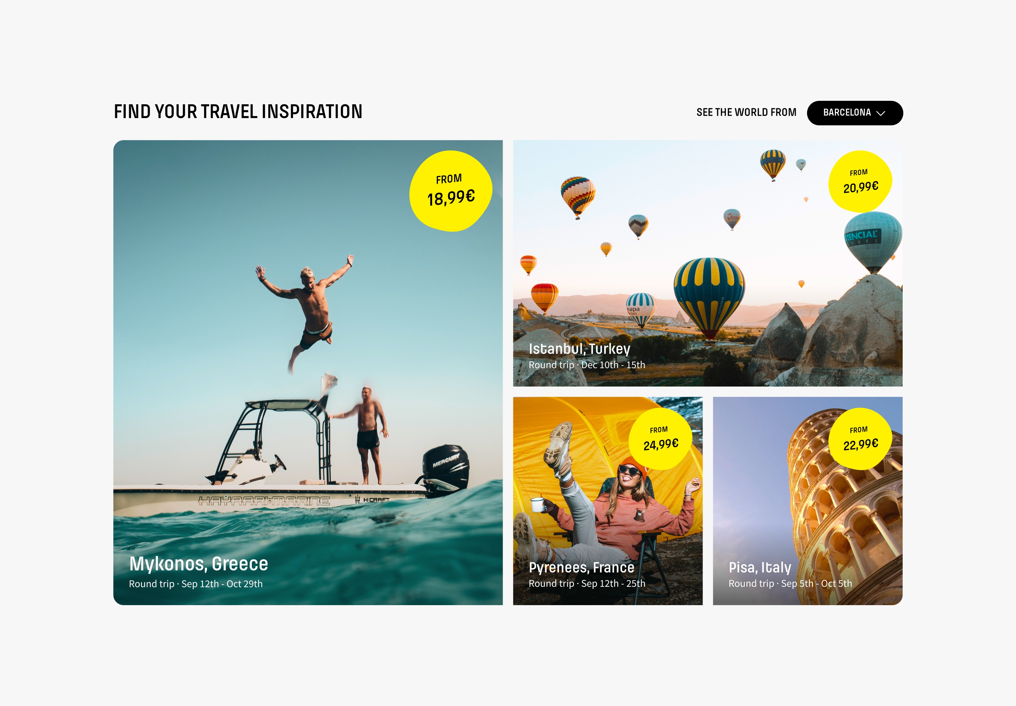
Clearer by design

To elevate the user experience and eliminate unnecessary complexity, we crafted a design that breathes simplicity. With carousels, accordions, and modals, we’ve streamlined content, allowing users to discover what they need—on their terms, at their pace.

The impact

We tested the website with real users throughout the project, measuring the impact the refined experience had on conversion rates

We tested the website with real users throughout the project, measuring the impact the refined experience had on conversion rates

In order to test our solution in multiple regions of Europe, we used the online user testing tool Maze. We set up a series of tasks such as 'Choose the cheapest flight this week' and 'Upgrade your seat to the most spacious option'. Using the platform, we were then able to watch users as they navigated through the prototype, shining a light on areas that needed to be improved.

Next Project

Next Project

Huru

Brand & Product design

Financial services

Huru

Brand & Product design

Financial services

Got a great idea?

Copyright

© GRAZIER 2024

Got a great idea?

Copyright

© GRAZIER 2024

Got a great idea?

Copyright

© GRAZIER 2024